

.svg)


Real products are dynamic, interactive, and a little subjective. That’s why design decisions over a static Figma file are not always be easy. At Rootly, we build small, standalone design playgrounds to feel the work sooner and make better decisions faster.
We started with our new form components and never looked back.
Grounded cross-functional decisions.
Playgrounds make decisions verifiable. Meetings and long threads multiply opinions without resolving them; putting working components in everyone’s hands changes the conversation from “I think” to “this feels better.”
When the team can actually tab through fields, miss an input, or hit submit on a flaky network, the right path becomes obvious in minutes. The discussion stops orbiting taste and starts orbiting truth.
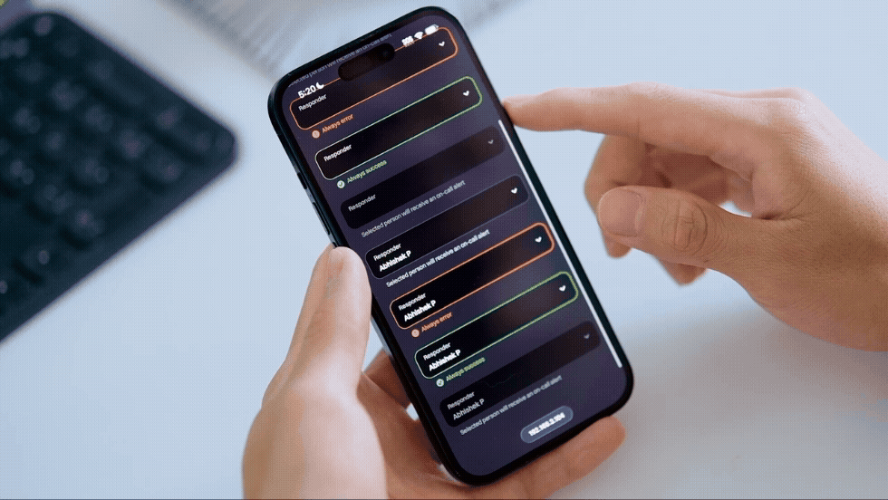
They also help us iterate faster, together. Designers, engineers, and leadership gather around the same living surface, not a mock or a thought experiment. We spin them up quickly with Vite and Base UI’s headless components. That combo lets us control behavior without wrestling a full design system and keeps the build focused on the question we’re trying to answer.
Our forms playground came together within three hours: fixtures for happy paths and failures, simple latency toggles, keyboard-first navigation, and just enough styling to make states readable. By the time we shared a link, the debate had shrunk to a few crisp choices we could feel and decide.
Take the time to save time.
Yes, it’s an extra step between Figma and building. It’s also the step that shortens the loop. Static screens are perfect for layout and visual direction; they’re less perfect for the real-world behavior that makes or breaks a flow. A quick playground bridges the gap. Instead of guessing whether inline or summary errors help people recover faster, we try both. Instead of arguing about optimistic updates, we add a modest delay and watch whether it reassures or confuses. Rather than assuming desktop and mobile can share identical patterns, we feel the difference and tune accordingly.
Time “spent” on a playground comes back as less rework, fewer surprises, and smoother handoffs, especially on mobile, where development generally moves slower and changes are expensive.
Surfacing real interactions.
The payoff shows up in confidence and quality. Interactive prototypes surface details static screens miss and that often cause slowdowns later: focus states that wander, validation flows that punish, keyboard behavior that traps, edge cases that break tone, fetching and latency that turn intent into doubt. When we catch those early, we’re not just preventing bugs; we’re aligning on how the product should feel. The playground becomes a north star for implementation, so engineering lands closer to the vision without decoding a dozen comment threads.
Our forms work is a good example. We tested three paths: purely inline errors on blur, a post-submit summary with anchors, and a hybrid. On desktop, the summary made recovery obvious: one place to scan, one checklist to clear. On mobile, the same summary felt heavy; inline nudges under the fields got people back on track faster. None of that was obvious in a static comp, and all of it was obvious in the playground.
The decision practically made itself: ship the hybrid, give mobile a bit more weight on inline cues, and keep the summary strong on desktop. Because everyone had felt the flow, handoff was clean. The states we needed already existed. The little things, focus after submit, what happens on a 600ms delay, how errors read when they return, weren’t mysteries anymore.
Prioritizing action over opinions.
There’s a cultural effect, too. Playgrounds nudge us toward action over opinion. A designer frames the question, what we’re testing, what would change our minds, and what decision this will unlock, and sketches the first pass. Then brings production constraints into the sandbox so we don’t test a fantasy.
Our PMs and product engineers anchor us on outcomes. Leadership reaffirms principle and priority. No ceremony, no theater, just a shared, tactile artifact that moves the team forward. You can run that loop in an hour without scheduling a single meeting.
We keep the habit healthy by keeping it light. The goal isn’t to build infrastructure; it’s to learn. That’s why we prefer simple fixtures over real backends, toggles over config files, and just enough styling to see the states.
When we use playgrounds.
If a playground starts to feel like a mini product, we stop. If it takes longer than a meeting plus a Slack thread, we’ve overbuilt it.
Most playgrounds live just long enough to answer the question and then get archived. A few stick around as references, the ones that clarified a pattern or crystallized a principle, but even those have a shelf life. Ephemerality keeps us honest and makes it easy to start the next one.
Not every problem needs a playground. When the decision is purely visual and static comps will do, we stay in Figma. When the tradeoffs live deep in the backend and “feel” won’t change the answer, we don’t pretend a UI prototype will help. We reach for a playground when interaction and timing matter: forms, keyboard-driven flows, streamed results, anything whose success is measured in seconds saved and friction avoided.
Conclusion
This rhythm works for us: make it real, feel it together, decide quickly, and build with conviction. It scales from one person to a cross-functional group without extra process and respects everyone’s time. Most importantly, it respects our users. They meet our product during high-pressure moments. The best way to honor that is to experience the product ourselves, early, honestly, and often, so the version we ship feels right the first time.
Design playgrounds aren’t ceremony; they’re a habit that keeps us close to reality. By turning “I think” into “this feels,” we debate less, rework less, and ship more experiences that hold up when it matters most.